
Power BI vs Tableau – Which Analytics Tool is Best for You to Learn
- Posted by 3.0 University
- Categories Emerging Technology
- Date January 16, 2025
- Comments 0 comment
In a time when data is very important, changing basic information into compelling visual stories is very helpful.
Here’s where we discover that robust analytics tools such as Power BI and Tableau crucially come into play; most certainly, each of those offering unique features tailored to meet the diverse needs of users.
The quintessential analogy may be like deciding between a classic Swiss watch and a modern smartwatch, when one has to choose between these two platforms; both can tell time but in very different ways.
Users of Microsoft products find Power BI easy to use, while Tableau impresses with its advanced visuals and robust analysis features.
Knowing the specific benefits and drawbacks of each tool can help make better learning decisions.
As we look further into this comparison, it becomes clear that picking the right analytics tool is not just about liking one over the other—it is about matching capabilities with one’s analysis goals and company objectives.

Overview of the importance of data visualization tools in modern analytics
In a world that relies more on data, being able to turn complex data sets into clear insights is very important. Data visualization tools are vital in this process, changing raw figures into engaging stories that help with decision-making.
Thus, having the best data visualization tools as much imperative.
These tools help spot patterns and trends that regular tables might miss, providing clear context that appeals to both technical and non-technical audiences. As businesses deal with huge amounts of data, strong visualization techniques highlight the need for training in tools like Power BI and Tableau.
Each tool has its own benefits: Power BI works well with Microsoft products, while Tableau is better for advanced analysis and user interaction.
Choosing between these options is crucial, as being skilled in the right data visualization software not only boosts an individual’s analytical skills but also helps organizations make better use of their data in a competitive environment.
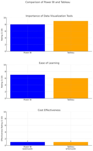
The chart compares Power BI and Tableau across three metrics: Importance of Data Visualization Tools, Ease of Learning, and Cost Effectiveness. Power BI scored 8 and 7, while Tableau received scores of 9 and 6 for importance and ease of learning, respectively.
In terms of cost effectiveness, Power BI is more affordable at $10/month with a rating of 4, compared to Tableau which is priced at $70/month and scored 6. This visualization helps in understanding the strengths and weaknesses of both tools.
Power BI: Features and Benefits
In business analytics, turning raw data into useful insights is very important, and Power BI does this well. It comes with many combined features that give users tools to make interactive visualizations, which helps with decision-making.
The platform works well with other Microsoft products like Excel and Dynamics, letting users use what they already know to easily start using Power BI.
The platform’s ability to link to various data sources further enhances this easy connection, making it adaptable for different organizations.
As users interact with its engaging interface, they can build detailed dashboards that show important information clearly, demonstrating how Power BI serves as a business analytics service from Microsoft.
In the end, these features make Power BI not just a strong tool for data analysis but also a fantastic option for anyone wanting to improve their analytics skills in a competitive field.
If one had to fall into the cycle of the Tableau vs Power BI comparisons, then here’s what the table resonates:
Feature | Power BI | Tableau |
Data Connectivity | Over 120 data sources, including Excel, SQL Server, and cloud services | Over 75 data sources, including Excel, SQL Server, and cloud services |
User Interface | Intuitive interface with drag-and-drop functionality | Complex but powerful interface, suitable for advanced users |
Cost | Starting at $9.99 per user/month for Pro version | Starting at $70 per user/month for Tableau Creator |
Integration with Other Tools | Seamless integration with Microsoft products like Excel, Azure, and Teams | Integrates with a variety of tools, but less seamless with Microsoft products |
Visualizations | Offers a wide range of built-in visualizations and custom visuals | Known for advanced visualizations and flexibility in design |
Collaboration | Strong collaborative features within Microsoft ecosystem | Good collaboration but requires separate licensing for Tableau Server |
Power BI Features and Benefits Comparison

User-friendly interface and integration with Microsoft products
Finding the right data visualization tools can be a daunting task, making the user interface design and integration features crucial for potential users. Power BI is notable for its ease of use and smooth integration, especially for those using Microsoft products.
Its simple interface is like a tidy library, helping users—no matter their skill level—to easily find and manage data. Users can take advantage of well-known Microsoft programs, like Excel and SharePoint, which improve workflow and encourage teamwork.
On the other hand, Tableau, while it provides strong and visually attractive options for exploring data, can be harder to learn and less straightforward, especially for beginners.
This highlights how important user-friendliness and integration are in making a choice, often leading users to choose Power BI as a beneficial starting point for data analytics.

Tableau: Features and Benefits
Given the field immensely competitive field that data visualization tools is, for sure, Tableau stands out as a strong option. It provides an exhaustive range of features that meet the requirements of analysts and decision-makers.
Its unrivalled solid abilities and potentialities enable users to connect to different types of data sources easily, improving the tool’s flexibility and usefulness.
Predominantly, out of many, data visualisation is one of Tableau’s key strengths that enables users to create interactive and engaging dashboards that turn data into clear stories.
As one expert notes, Tableau excels in connecting to many kinds of data sources, such as relational databases, cloud storage, and large data platforms.
This flexibility helps users work with complex datasets easily and encourages a better understanding of the data through easy-to-understand visual displays.
Thus, the advantages of using Tableau go beyond basic analytics, helping to create a data-driven decision-making culture that is crucial in today’s fast-moving business world.
Feature | Benefit |
Data Connectivity | Connects to various data sources including cloud, on-premises, and big data. |
User Interface | Intuitive drag-and-drop interface, enabling users to create interactive dashboards easily. |
Real-time Data Analysis | Allows for real-time data updates and live connection to data sources for instant insights. |
Advanced Analytics | Includes capabilities for complex calculations, forecasts, and trend analysis within visualizations. |
Collaboration Tools | Facilitates sharing and collaboration with dashboards that can be accessed and annotated by team members. |
Customizable Visualizations | Offers a wide range of customization options for charts and graphs to fit specific needs. |
Mobile Support | Mobile-responsive dashboards that provide access to analytics on tablets and smartphones. |
Tableau Features and Benefits Comparison
Advanced data visualization capabilities and flexibility in handling complex datasets
When it’s about data analytics, turning complex data into easy-to-understand visuals is very important, which is, undoubtedly, like how an artist creates a work of art from a blank canvas.
Tableau and power BI both provide advanced data visualization tools designed for different user needs, but they differ in how they handle flexibility and complexity.
Tableau excels at managing complicated data relationships with its wide range of visualization options and customizable dashboards, which let users easily explore and manipulate data dimensions.
On the other hand, Power BI offers a more straightforward experience, using its connection with familiar Microsoft products to enable quick insights, even though it can have performance issues when working with enormous datasets.
Therefore, the choice between these two strong tools depends not only on their visual capabilities but also on what the user specifically needs, making the decision a careful balance of functionality and adaptability.
Conclusion
In the end, choosing between Power BI and Tableau depends on users’ needs and backgrounds, not just features.
Each tool has its own strengths for different analysis needs—Power BI is usually better for those wanting affordable and simple data visualization, which is excellent for organizations that don’t want to spend too much money.
On the other hand, Tableau is known for its strong visual analytics, making it a go-to for users who need detailed data storytelling. Users’ adoption of each platform also depends on how they learn it.
For beginners, Power BI’s simple layout might help them learn faster, while Tableau’s complex features will suit those with deeper analytical skills.
Charts that compare both tools, like the one in [citeX], clearly show these differences, helping users choose wisely.
Therefore, the final decision depends on personal abilities, budgets, and the specific goals for data analysis.
Summary of key differences and recommendations for potential learners based on their needs and goals.
When looking at Power BI and Tableau, it’s important for learners to connect their choice with personal goals and real needs.
For those who want to learn data visualization without needing much technical skill, Power BI is easier to use, offering a gentler learning curve and many beginner resources.
On the other hand, Tableau is better for people wanting advanced analysis and detailed visual stories, even if it requires more time to learn.
Additionally, those working with limited budgets may prefer Power BI’s price model, which includes a strong free version.
In contrast, organizations that need advanced analytics and more customization might find that Tableau’s premium features are worth the cost.
In the end, picking between Power BI and Tableau depends not just on what each tool can do but also on the learner’s specific situation.
Therefore, it’s key to carefully assess their unique goals and needs, as shown in the comparison, which clearly compares the features of each platform.
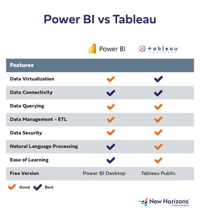
Image1. Comparison of Features between Power BI and Tableau
You may also like

What is more Important Degree or skill?

How AutoML and No-Code AI are Changing Industries?

